Lecture 9: Density Estimation
Contents
Lecture 9: Density Estimation#
Next, we will look at a specific problem within unsupervised learning—density estimation.
9.1. Outlier Detection Using Probabilistic Models#
Density estimation is the problem of estimating a probability distribution from data. Let’s first look at a motivating practical problem that involves performing density estimation: outlier detection.
9.1.1. Outlier Detection#
Suppose we have a (unsupervised) dataset \(\mathcal{D} = \{x^{(i)} \mid i = 1,2,...,n\}\). For example, each \(x^{(i)}\) could represent:
A summary of traffic logs on a computer network
The state of a machine in a factory
The goal of outlier detection is, given a new input \(x'\), we want to determine whether \(x'\) is “normal” or not. Formally, we assume that the dataset \(\mathcal{D}\) is sampled IID from the data distribution \(P_\text{data}\). We denote this as
Outlier detection can be thought of as answering the question:
9.1.2. Probabilistic Models#
Our strategy for performing outlier detection with rely on a probabilistic model of a data distribution.
An unsupervised probabilistic model is a probability distribution
that maps datapoints to probabilities. Probabilistic models often have parameters \(\theta \in \Theta\).
9.1.2.1. Why Use Probabilistic Models?#
A good probabilistic model \(P_\theta\) that approximates the data distribution has many applications. Here are some tasks that can be solved using \(P_\theta\):
Generation: sample new objects from \(P_\theta\), such as images, text, or audio data.
Structure learning: find interesting structure in \(P_\text{data}\) (e.g., clusters of similar cancer tumors that form a common cancer subtype).
Outlier detection: approximate \(P_\theta \approx P_\text{data}\) and use it to detect points \(x'\) which are unlikely to have originated from the data distribution.
The latter task will serve as the motivating application for this section.
9.1.2.3. Maximum Likelihood Estimation#
So how exactly can one learn a probabilistic model \(P_\theta(x)\), i.e., learn good/optimal \(\theta\), that estimates the data distribution \(P_\text{data}\)?
One way we can do that is by optimizing the maximum log-likelihood objective
This asks that \(P_\theta\) assign a high probability to the training instances in the dataset \(\mathcal{D}\).
Maximizing likelihood is closely related to minimizing the Kullback-Leibler (KL) divergence \(D(\cdot\|\cdot)\) between the model distribution and the data distribution.
The KL divergence is always non-negative, and equals zero when \(P_\text{data}\) and \(P_\theta\) are identical. This makes it a natural measure of similarity that’s useful for comparing distributions. The above equation indicates that maximizing the likelihood is equivalent to minimizing the KL divergence between the data and the model distribution.
9.1.3. Density Estimation#
The task of density estimation is to learn a probabilistic model \(P_\theta\) on an unsupervised dataset \(\mathcal{D}\) to approximate the true data distribution \(P_\text{data}\).
We can naturally perform outlier detection with a probabilistic model:
Density estimation: We fit \(P_\theta\) on \(\mathcal{D}\) to approximate \(P_\text{data}\)
Outlier detection: Given \(x'\), we use \(P_\theta(x')\) to determine if \(x'\) is an outlier.
9.1.3.1. Toy Example: Flipping a Random Coin#
How should we choose \(P_\theta(x)\), i.e., choose \(\theta\), if 3 out of 5 coin tosses are heads? Let’s apply maximum likelihood learning.
Our model is \(P_\theta(x=H)=\theta\) and \(P_\theta(x=T)=1-\theta\)
Our data is: \(\{H,H,T,H,T\}\)
The likelihood of the data is \(\prod_{i} P_\theta(x_i)=\theta \cdot \theta \cdot (1-\theta) \cdot \theta \cdot (1-\theta)\).
We optimize for \(\theta\) which makes the data most likely. What is the solution in this case?
Below we plot the likelihood of the observed data (3 heads out of 5 coin tosses) vs \(\theta\):
%matplotlib inline
import numpy as np
from matplotlib import pyplot as plt

# our dataset is {H, H, T, H, T}; if theta = P(x=H), we get:
coin_likelihood = lambda theta: theta*theta*(1-theta)*theta*(1-theta)

theta_vals = np.linspace(0,1)
# plot the likedlihood at each theta
plt.plot(theta_vals, coin_likelihood(theta_vals))
[<matplotlib.lines.Line2D at 0x1168f7390>]
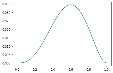
You can see that the maximum likelihood \(\theta\) is \(0.6\).
Given a trained model \(P_\theta\) with \(\theta = 0.6\), we can ask for the probability of seeing a sequence of ten tails:
This gives us an estimate of whether certain sequences are likely or not. If they are not, then they are outliers!
9.2. Kernel Density Estimation#
Next, we will look at an important technique for estimating densities.
9.2.1. Histogram Density Estimation#
Perhaps, one of the simplest approaches to density estimation (constructing and estimating a probabilistic model) is by forming a histogram.
To construct a histogram, we partition the input space \(x\) into a \(d\)-dimensional grid we and count the number of points in each cell/bin.
9.2.2.1. Histogram Density Estimation: Example#
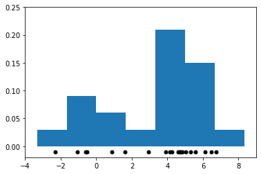
This is best illustrated by an example. Let’s start by creating a simple 1D dataset coming from a mixture of two Gaussians:
Below, we draw some samples to generate this dataset.
# https://scikit-learn.org/stable/auto_examples/neighbors/plot_kde_1d.html
import numpy as np
np.random.seed(1)

N = 20 # number of points
# concat samples from two Gaussians:
X = np.concatenate((
    np.random.normal(0, 1, int(0.3 * N)),
    np.random.normal(5, 1, int(0.7 * N))
))[:, np.newaxis]

# print out X
print(X.flatten())
[ 1.62434536 -0.61175641 -0.52817175 -1.07296862  0.86540763 -2.3015387
  6.74481176  4.2387931   5.3190391   4.75062962  6.46210794  2.93985929
  4.6775828   4.61594565  6.13376944  3.90010873  4.82757179  4.12214158
  5.04221375  5.58281521]
We can now estimate the density of the distribution that generated these samples via a histogram: we partition the space of \(x\)’s into bins and we counting the number of datapoints in each bin.
We visualize the resulting histogram below.
import matplotlib.pyplot as plt

# We set the number of bins to be equal to 10 - 1 = 9 (np.linspace gets us boundaries of the bins)
# Though the figure seems like it has less than 9 bins because some bins do not have any data
bins = np.linspace(-5, 10, 10)
plt.hist(X[:, 0], bins=bins, density=True) # plot the histogram
plt.plot(X[:, 0], np.full(X.shape[0], -0.01), '.k', markersize=10) # plot the points in X
plt.xlim(-4, 9)
plt.ylim(-0.02, 0.25)
(-0.02, 0.25)
9.2.2.2. Limitations of Histograms#
Though conceptually simple, histogram-based methods have a number of shortcomings:
The histogram is not “smooth”. We usually expect the density around \(x\) to not have large and sudden changes in magnitude.
The shape of the histogram depends on the bin positions.
The number of grid cells needed to partition the input space of \(x\) increases exponentially with the dimension \(d\) of \(x\).
Let’s visualize what we mean when we say that shape of the histogram depends on the histogram bins. Below we plot two figures; the bins of the right figure are the bins of the left figure shifted by 0.75:
fig, ax = plt.subplots(1, 2, sharex=True, sharey=True, figsize=(12,4))
ax[0].hist(X[:, 0], bins=bins, density=True) # plot the histogram
ax[1].hist(X[:, 0], bins=bins+0.75, density=True) # plot the histogram with bin centers shifted by 0.75
for axi in ax.ravel():
    axi.plot(X[:, 0], np.full(X.shape[0], -0.01), '.k', markersize=10) # plot the points in X
    axi.set_xlim(-4, 9)
    axi.set_ylim(-0.02, 0.3)
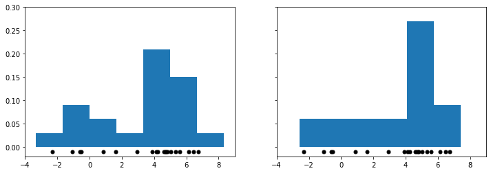
As you can see, the two figures look very different after just a small shift of the bins. This is somewhat problematic: how do we decide which of these two different histograms is correct?
Our next density estimation method addresses this problem.
9.2.3. Kernel Density Estimation#
Kernel density estimation (KDE) is a different approach to density estimation that address some of the issues of histogram density estimation.
In histogram density estimation, the density is proportional to:
In kernel density estimation, the density is proportional to:
Here, \(\propto\) means “proportional to” (up to a normalizing constant). In other words:
If \(x\) is in an area with many points in \(\mathcal{D}\), then \(P_\theta(x)\) is large
If \(x\) is in an area with few points in \(\mathcal{D}\), then \(P_\theta(x)\) is small
You can also view KDE as counting the % of points that fall in a “bin” centered at \(x\).
9.2.3.1 Tophat Kernel Density Estimation#
The simplest form of this strategy (Tophat KDE) assumes a model of the form
where
is the number of points that are within a bin of with \(\delta\) centered at \(x\).
This is best understood via a picture. Below we fit Tophat KDE on the 1D mixture of two Gaussians dataset from the previous section and we visualize the result.
from sklearn.neighbors import KernelDensity

kde = KernelDensity(kernel='tophat', bandwidth=0.75).fit(X) # fit a KDE model
x_ticks = np.linspace(-5, 10, 1000)[:, np.newaxis] # choose 1000 points on x-axis
log_density = kde.score_samples(x_ticks) # compute density at 1000 points

plt.fill(x_ticks[:, 0], np.exp(log_density)) # plot the density estimate
plt.plot(X[:, 0], np.full(X.shape[0], -0.01), '.k', markersize=10) # plot the points in X as black dots
plt.xlim(-4, 9)
plt.ylim(-0.02, 0.32)
(-0.02, 0.32)
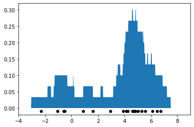
Note that the above density estimate no longer depends on the position of bins like histogram density estimation (in fact, there are no bins). However, it still has the problem of producing a density estimate that is not smooth: the curve looks very jagged.
We are going to resolve this by replacing histogram counts with weighted averages across the full dataset.
We count all points \(x^{(i)}\), but each gets a \(\text{weight}(x^{(i)}, x)\) that is large if \(x^{(i)}\) and \(x\) are “similar”. We define this notion of “similarity” in the next section.
9.2.3.2. Kernels and Kernel Density Estimation#
A kernel function \(K : \mathcal{X} \times \mathcal{X} \to [0, \infty]\) maps pairs of vectors \(x, z \in \mathcal{X}\) to a real-valued score \(K(x,z)\). A kernel represents the similarity between \(x\) and \(z\): more similar pairs of points get a larger kernel value.
A kernelized density model \(P\) takes the form:
This can be interpreted in several ways:
We count the number of points “near” \(x\), but each \(x^{(i)}\) has a weight \(K(x, x^{(i)})\) that depends on similarity between \(x, x^{(i)}\).
We place a “micro-density” \(K(x, x^{(i)})\) at each \(x^{(i)}\); the final density \(P(x)\) is their mixture.
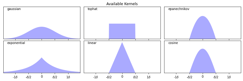
9.2.3.3. Types of Kernels#
There exist many types of kernels that can be used for density estimation.
The following kernels are available in scikit-learn.
Gaussian kernel \(K(x,z; \delta) \propto \exp(-||x-z||^2/2\delta^2)\)
Tophat kernel \(K(x,z; \delta) = 1 \text{ if } ||x-z|| \leq \delta/2\) else \(0\).
Epanechnikov kernel \(K(x,z; \delta) \propto 1 - ||x-z||^2/\delta^2\)
Exponential kernel \(K(x,z; \delta) \propto \exp(-||x-z||/\delta)\)
Linear kernel \(K(x,z; \delta) \propto (1 - ||x-z||/\delta)^+\)
It’s easier to understand these kernels by visualizing them, as we do below.
# https://scikit-learn.org/stable/auto_examples/neighbors/plot_kde_1d.html
X_plot = np.linspace(-6, 6, 1000)[:, None]
X_src = np.zeros((1, 1))

fig, ax = plt.subplots(2, 3, sharex=True, sharey=True, figsize=(12,4))
fig.subplots_adjust(left=0.05, right=0.95, hspace=0.05, wspace=0.05)

def format_func(x, loc):
    if x == 0:
        return '0'
    elif x == 1:
        return '$\delta/2$'
    elif x == -1:
        return '-$\delta/2$'
    else:
        return '%i$\delta$' % (int(x/2))

for i, kernel in enumerate(['gaussian', 'tophat', 'epanechnikov',
                            'exponential', 'linear', 'cosine']):
    axi = ax.ravel()[i]
    log_dens = KernelDensity(kernel=kernel).fit(X_src).score_samples(X_plot)
    axi.fill(X_plot[:, 0], np.exp(log_dens), '-k', fc='#AAAAFF')
    axi.text(-2.6, 0.95, kernel)

    axi.xaxis.set_major_formatter(plt.FuncFormatter(format_func))
    axi.xaxis.set_major_locator(plt.MultipleLocator(1))
    axi.yaxis.set_major_locator(plt.NullLocator())

    axi.set_ylim(0, 1.05)
    axi.set_xlim(-2.9, 2.9)

ax[0, 1].set_title('Available Kernels')
Text(0.5, 1.0, 'Available Kernels')
9.2.3.4. Kernel Density Estimation: Example#
Let’s look at an example in the context of the 1D points (mixture of two Gaussians) we have seen earlier. We will fit a model of the form
with a Gaussian kernel \(K(x,z; \delta) \propto \exp(-||x-z||^2/2\delta^2)\).
Below we plot the density estimate as blue line, the datapoints as black dots, and the kernels are illustrated by red dotted lines.
from sklearn.neighbors import KernelDensity

kde = KernelDensity(kernel='gaussian', bandwidth=0.75).fit(X) # fit a KDE model
x_ticks = np.linspace(-5, 10, 1000)[:, np.newaxis] # choose 1000 points on x-axis
log_density = kde.score_samples(x_ticks) # compute density at 1000 points
gaussian_kernel = lambda z : lambda x: np.exp(-np.abs(x-z)**2/(0.75**2)) # gaussian kernel
kernel_linspace = lambda x : np.linspace(x-1.2,x+1.2,30)

plt.figure(figsize=(12,4))
plt.plot(x_ticks[:, 0], np.exp(log_density)) # plot the density estimate
plt.plot(X[:, 0], np.full(X.shape[0], -0.01), '.k', markersize=10) # plot the points in X as black dots
plt.plot(kernel_linspace(4), 0.07*gaussian_kernel(4)(kernel_linspace(4)), '--', color='r', alpha=0.75)
plt.plot(kernel_linspace(5), 0.07*gaussian_kernel(5)(kernel_linspace(5)), '--', color='r', alpha=0.75)
plt.plot(kernel_linspace(1), 0.07*gaussian_kernel(1)(kernel_linspace(1)), '--', color='r', alpha=0.75)
plt.xlim(-4, 9)
plt.ylim(-0.02, 0.32)
(-0.02, 0.32)
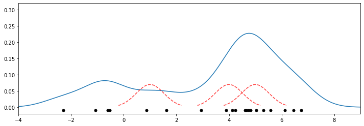
Recall that the dataset is a mixture of two Gaussians centered at \(x = 0\) and \(x = 5\). This estimate does look consistent with that.
9.2.3.5. KDE in Higher Dimensions#
In principle, kernel density estimation also works in higher dimensions. However, the number of datapoints needed for a good fit increases exponentially with the dimension, which limits the applications of this model in high dimensions.
9.2.3.6. Choosing Hyperparameters for Kernels#
Each kernel has a notion of “bandwidth” \(\delta\). This is a hyperparameter that controls the “smoothness” of the fit.
We can choose it using inspection or heuristics like we did for \(K\) in \(K\)-Means.
Because we have a probabilistic model, we can also estimate likelihood on a holdout dataset (more on this later!)
Let’s illustrate how the bandwidth affects smoothness via an example. Below we plot two figures; on the left we have a very high bandwidth, and on the right we have a very low bandwidth.
from sklearn.neighbors import KernelDensity

kde1 = KernelDensity(kernel='gaussian', bandwidth=3).fit(X) # fit a KDE model
kde2 = KernelDensity(kernel='gaussian', bandwidth=0.2).fit(X) # fit a KDE model

fig, ax = plt.subplots(1, 2, sharex=True, sharey=True, figsize=(12,4))
ax[0].fill(x_ticks[:, 0], np.exp(kde1.score_samples(x_ticks))) # plot the density estimate
ax[1].fill(x_ticks[:, 0], np.exp(kde2.score_samples(x_ticks))) # plot the density estimate
ax[0].set_title('Bandwidth Too High')
ax[1].set_title('Bandwidth Too Low')

for axi in ax.ravel():
    axi.plot(X[:, 0], np.full(X.shape[0], -0.01), '.k', markersize=10) # plot the points in X
    axi.set_xlim(-4, 9)
    axi.set_ylim(-0.02, 0.4)
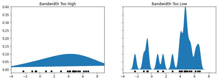
You can see that the left figure is too smoothed out, making us lose a lot of information. On the other hand, the right figure is highly non-smooth and its shape does not match at all that of the true distribution.
9.2.3.7. Algorithm: Kernel Density Estimation#
We summarize the kernel density estimation algorithm via the following model card.
Type: Unsupervised learning (density estimation).
Model family: Non-parametric. Sum of \(n\) kernels.
Objective function: Log-likelihood to choose optimal bandwidth.
Optimizer: Grid search.
The pros and cons of this algorithm can be summarized as follows.
Pros:
KDE can in theory approximate any data distribution arbitrarily well.
Cons:
Need to store the entire dataset to make queries, which is computationally prohibitive.
Number of data needed scale exponentially with dimension (“curse of dimensionality”).
9.3. Nearest Neighbors#
We are now going to take a little detour back to supervised learning and apply some of these density estimation ideas to supervised learning. Specifically, we will look at an algorithm called Nearest Neighbors.
9.3.1. A Simple Classification Algorithm: Nearest Neighbors#
Suppose we are given a training dataset \(\mathcal{D} = \{(x^{(1)}, y^{(1)}), (x^{(2)}, y^{(2)}), \ldots, (x^{(n)}, y^{(n)})\}\). At inference time, we receive a query point \(x'\) and we want to predict its label \(y'\).
A really simple but surprisingly effective way of returning \(y'\) is the nearest neighbors approach.
Given a query datapoint \(x'\), find the training example \((x, y)\) in \(\mathcal{D}\) that’s closest to \(x'\), in the sense that \(x\) is “nearest” to \(x'\)
Return \(y\), the label of the “nearest neighbor” \(x\).
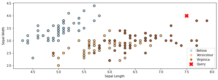
In the example below on the Iris dataset, the red cross denotes the query \(x'\). The closest class to it is “Virginica”. (We’re only using the first two features in the dataset for simplicity.)
import matplotlib.pyplot as plt
plt.rcParams['figure.figsize'] = [12, 4]

# Plot also the training points
p1 = plt.scatter(iris_X.iloc[:, 0], iris_X.iloc[:, 1], c=iris_y,
            edgecolor='k', s=50, cmap=plt.cm.Paired)
p2 = plt.plot([7.5], [4], 'rx', ms=10, mew=5)
plt.xlabel('Sepal Length')
plt.ylabel('Sepal Width')
plt.legend(['Query Point', 'Training Data'], loc='lower right')
plt.legend(handles=p1.legend_elements()[0]+p2, labels=['Setosa', 'Versicolour', 'Virginica', 'Query'], loc='lower right')
<matplotlib.legend.Legend at 0x12982b4e0>
9.3.2. Choosing a Distance Function#
How do we select the point \(x\) that is the closest to the query point \(x'\)? There are many options:
The Euclidean distance \(|| x - x' ||_2 = \sqrt{\sum_{j=1}^d |x_j - x'_j|^2)}\) is a popular choice.
The Minkowski distance \(|| x - x' ||_p = (\sum_{j=1}^d |x_j - x'_j|^p)^{1/p}\) generalizes the Euclidean, L1 and other distances.
The Mahalanobis distance \(\sqrt{x^\top V x}\) for a positive semidefinite matrix \(V \in \mathbb{R}^{d \times d}\) also generalizes the Euclidean distance.
Discrete-valued inputs can be examined via the Hamming distance \(|\{j : x_j \neq x_j'\}|\) and other distances.
Let’s apply Nearest Neighbors to the above dataset using the Euclidean distance (or equivalently, Minkowski with \(p=2\)) Below we color each position in the grid with the class color predicted by Nearest Neighbors with the Euclidean distance.
# https://scikit-learn.org/stable/auto_examples/neighbors/plot_classification.html
from sklearn import neighbors
from matplotlib.colors import ListedColormap

# Train a Nearest Neighbors Model
clf = neighbors.KNeighborsClassifier(n_neighbors=1, metric='minkowski', p=2)
clf.fit(iris_X.iloc[:,:2], iris_y)

# Create color maps
cmap_light = ListedColormap(['orange', 'cyan', 'cornflowerblue'])
cmap_bold = ListedColormap(['darkorange', 'c', 'darkblue'])

# Plot the decision boundary. For that, we will assign a color to each
# point in the mesh [x_min, x_max]x[y_min, y_max].
x_min, x_max = iris_X.iloc[:, 0].min() - 1, iris_X.iloc[:, 0].max() + 1
y_min, y_max = iris_X.iloc[:, 1].min() - 1, iris_X.iloc[:, 1].max() + 1
xx, yy = np.meshgrid(np.arange(x_min, x_max, 0.02),
                     np.arange(y_min, y_max, 0.02))
Z = clf.predict(np.c_[xx.ravel(), yy.ravel()])

# Put the result into a color plot
Z = Z.reshape(xx.shape)
plt.figure()
plt.pcolormesh(xx, yy, Z, cmap=cmap_light)

# Plot also the training points
plt.scatter(iris_X.iloc[:, 0], iris_X.iloc[:, 1], c=iris_y, cmap=cmap_bold,
            edgecolor='k', s=60)
plt.xlim(xx.min(), xx.max())
plt.ylim(yy.min(), yy.max())

plt.xlabel('Sepal Length')
plt.ylabel('Sepal Width')
Text(0, 0.5, 'Sepal Width')
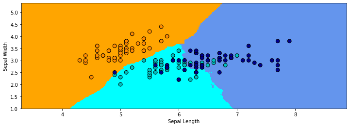
In the above example, the regions of the 2D space that are assigned to each class are highly irregular. In areas where the two classes overlap, the decision of the boundary flips between the classes, depending on which point is closest to it.
9.3.3. K-Nearest Neighbors#
Intuitively, we expect the true decision boundary to be smooth. Therefore, we average \(K\) nearest neighbors at a query point.
Given a query datapoint \(x'\), find the \(K\) training examples \(\mathcal{N} = \{(x^{(1)}, y^{(1)}), (x^{(2)}, y^{(2)}), \ldots, (x^{(K)}, y^{(K)})\} \subseteq D\) that are closest to \(x'\).
Return \(y_\mathcal{N}\), the consensus label of the neighborhood \(\mathcal{N}\).
The consesus \(y_\mathcal{N}\) can be determined by voting, weighted average, kernels, etc.
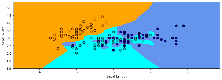
Let’s look at Nearest Neighbors with a neighborhood of 30. Once again, we color each position in the grid with the corresponding class color. The decision boundary is much smoother than before.
# https://scikit-learn.org/stable/auto_examples/neighbors/plot_classification.html
# Train a Nearest Neighbors Model
clf = neighbors.KNeighborsClassifier(n_neighbors=30, metric='minkowski', p=2)
clf.fit(iris_X.iloc[:,:2], iris_y)
Z = clf.predict(np.c_[xx.ravel(), yy.ravel()])

# Put the result into a color plot
Z = Z.reshape(xx.shape)
plt.figure()
plt.pcolormesh(xx, yy, Z, cmap=cmap_light)

# Plot also the training points
plt.scatter(iris_X.iloc[:, 0], iris_X.iloc[:, 1], c=iris_y, cmap=cmap_bold,
            edgecolor='k', s=60)
plt.xlim(xx.min(), xx.max())
plt.ylim(yy.min(), yy.max())

plt.xlabel('Sepal Length')
plt.ylabel('Sepal Width')
Text(0, 0.5, 'Sepal Width')
9.3.3.1. KNN Estimates Data Distribution#
Suppose that the output \(y'\) of KNN is the average target in the neighborhood \(\mathcal{N}(x')\) around the query \(x'\). Observe that we can write:
When \(x \approx x'\) and when the data distribution \(\mathbb{P}\) is reasonably smooth, each \(y\) for \((x,y) \in \mathcal{N}(x')\) is approximately a sample from \(\mathbb{P}(y\mid x')\) (since \(\mathbb{P}\) doesn’t change much around \(x'\), \(\mathbb{P}(y\mid x') \approx \mathbb{P}(y\mid x)\)).
Thus \(y'\) is essentially a Monte Carlo estimate of \(\mathbb{E}[y \mid x']\) (the average of \(K\) samples from \(\mathbb{P}(y\mid x')\)).
9.3.3.2. Algorithm: K-Nearest Neighbors#
We summarize the K-Nearest Neighbors algorithm below:
Type: Supervised learning (regression and classification)
Model family: Consensus over \(K\) training instances.
Objective function: Euclidean, Minkowski, Hamming, etc.
Optimizer: Non at training. Nearest neighbor search at inference using specialized search algorithms (Hashing, KD-trees).
Probabilistic interpretation: Directly approximating the density \(P_\text{data}(y|x)\).
We summarize the pros and cons of the algorithm below:
Pros:
Can approximate any data distribution arbtrarily well.
Cons:
Need to store entire dataset to make queries, which is computationally prohibitive.
Number of data needed scale exponentially with dimension (“curse of dimensionality”).
9.3.4. Non-Parametric Models#
Nearest neighbors is an example of a non-parametric model. Parametric vs. non-parametric are is a key distinguishing characteristic for machine learning models.
A parametric model \(f_\theta(x) : \mathcal{X} \times \Theta \to \mathcal{Y}\) is defined by a finite set of parameters \(\theta \in \Theta\) whose dimensionality is constant with respect to the dataset. Linear models of the form
are an example of a parametric model.
On the other hand, for a non-parametric model, the function \(f\) uses the entire training dataset (or a post-proccessed version of it) to make predictions, as in \(K\)-Nearest Neighbors. In other words, the complexity of the model increases with dataset size. Because of this, non-parametric models have the advantage of not losing any information at training time. Nevertheless, they are also computationally less tractable and may easily overfit the training set.