Practical Considerations When Applying Machine Learning
Suppose you trained an image classifier with 80% accuracy. What's next?
- Add more data?
- Train the algorithm for longer?
- Use a bigger model?
- Add regularization?
- Add new features?
We will next learn how to prioritize these decisions when applying ML.
Review: Overfitting (Variance)
Overfitting is one of the most common failure modes of machine learning.
- A very expressive model (a high degree polynomial) fits the training dataset perfectly.
- The model also makes wildly incorrect prediction outside this dataset, and doesn't generalize.
Models that overfit are said to be high variance.
Review: Underfitting (Bias)
Underfitting is another common problem in machine learning.
- The model is too simple to fit the data well (e.g., approximating a high degree polynomial with linear regression).
- As a result, the model is not accurate on training data and is not accurate on new data.
Because the model cannot fit the data, we say it's high bias.
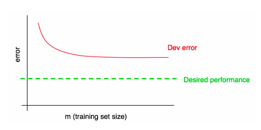
Learning Curves
Learning curves show performance as a function of training set size.
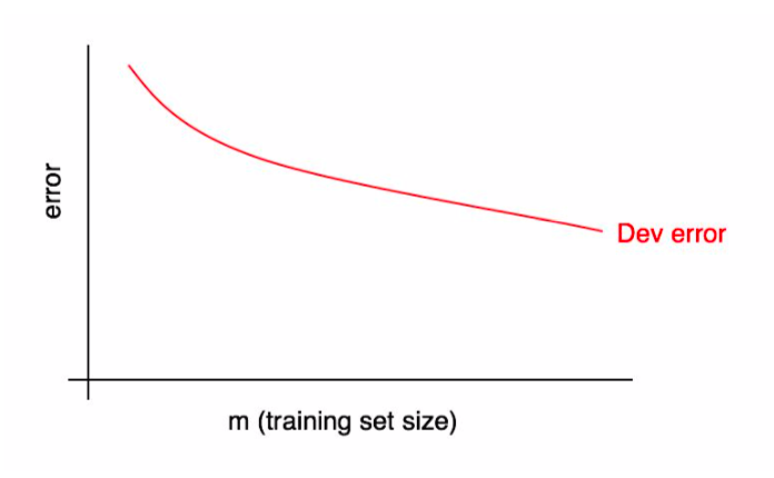
Learning curves are defined for fixed hyperparameters. Observe that dev set error decreases as we give the model more data.
Visualizing Ideal Performance
It is often very useful to have a target upper bound on performance (e.g., human accuracy); it can also be visualized on the learning curve.
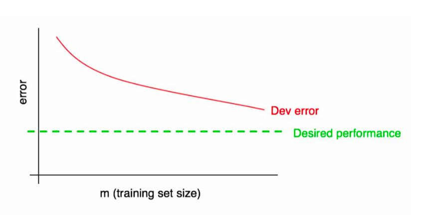
In the example below, the dev error has plateaued and we know that adding more data will not be useful.
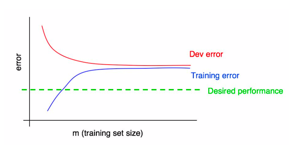
Learning Curves for the Training Set
We can further augment this plot with training set performance.
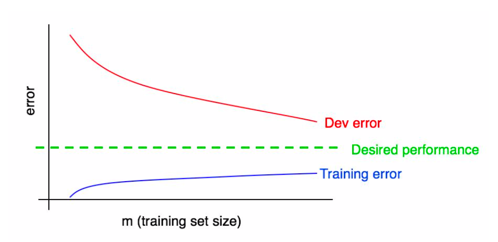
A few observations can be made here:
- Training error is normally less that dev set error: the training set is easier to fit.
- Training error increases with training set size because our model overfits small datasets.
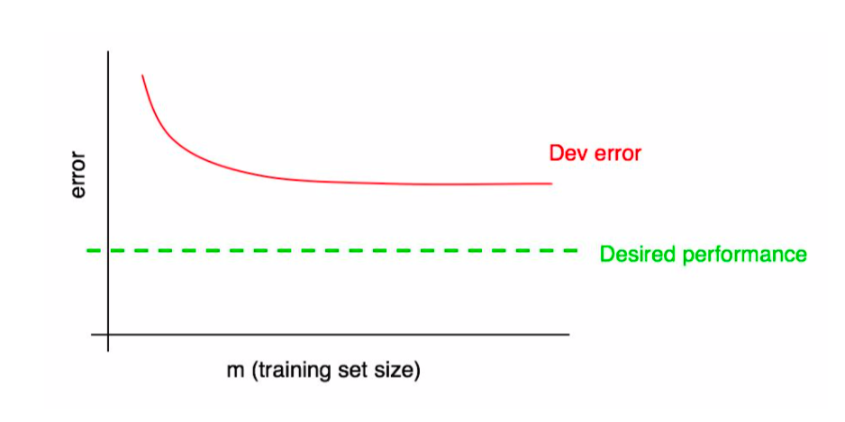
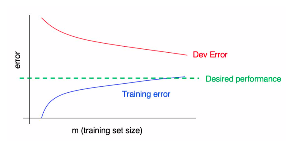
Diagnosing High Bias
Learning curves can reveal when we have a bias problem.
In practice, in can be hard to visually assess if the dev error has plateaued. Adding the training error makes this easier.
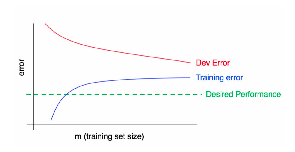
Diagnosing High Variance
The following plot shows we have high variance.
In this plot, we have both high variance and high bias.
Learning Curves: An Example
To further illustrate the idea of learning curves, consider the following example.
We will use the sklearn digits dataset, a downscaled version of MNIST.
# Example from https://scikit-learn.org/stable/auto_examples/model_selection/plot_learning_curve.html
from sklearn.datasets import load_digits
X, y = load_digits(return_X_y=True)
We can visualize these digits as follows:
from matplotlib import pyplot as plt

plt.figure(figsize=(8,16))
_, axes = plt.subplots(2, 5)
images_and_labels = list(zip(digits.images, digits.target))
for ax, (image, label) in zip(axes.flatten(), images_and_labels[:10]):
    ax.set_axis_off()
    ax.imshow(image, cmap=plt.cm.gray_r, interpolation='nearest')
    ax.set_title('Digit %i' % label)
<Figure size 576x1152 with 0 Axes>

This is boilerplate code for visualizing learning curves and it's not essential to understand this example.
import numpy as np
from sklearn.model_selection import learning_curve

def plot_learning_curve(estimator, title, X, y, axes=None, ylim=None, cv=None,
                        n_jobs=None, train_sizes=np.linspace(.1, 1.0, 5)):
    """Generate learning curves for an algorithm."""
    if axes is None:
        _, axes = plt.subplots(1, 3, figsize=(20, 5))

    axes[0].set_title(title)
    if ylim is not None:
        axes[0].set_ylim(*ylim)
    axes[0].set_xlabel("Training examples")
    axes[0].set_ylabel("Score")

    train_sizes, train_scores, test_scores, fit_times, _ = \
        learning_curve(estimator, X, y, cv=cv, n_jobs=n_jobs,
                       train_sizes=train_sizes,
                       return_times=True)
    train_scores_mean = np.mean(train_scores, axis=1)
    train_scores_std = np.std(train_scores, axis=1)
    test_scores_mean = np.mean(test_scores, axis=1)
    test_scores_std = np.std(test_scores, axis=1)
    fit_times_mean = np.mean(fit_times, axis=1)
    fit_times_std = np.std(fit_times, axis=1)

    # Plot learning curve
    axes[0].grid()
    axes[0].fill_between(train_sizes, train_scores_mean - train_scores_std,
                         train_scores_mean + train_scores_std, alpha=0.1,
                         color="r")
    axes[0].fill_between(train_sizes, test_scores_mean - test_scores_std,
                         test_scores_mean + test_scores_std, alpha=0.1,
                         color="g")
    axes[0].plot(train_sizes, train_scores_mean, 'o-', color="r",
                 label="Training Accuracy")
    axes[0].plot(train_sizes, test_scores_mean, 'o-', color="g",
                 label="Dev Set Accuracy")
    axes[0].legend(loc="best")

    return plt
We visualize learning curves for two algorithms:
- Gaussian Naive Bayes model, a version of Naive Bayes for continuous inputs $x$
- A support vector machine with a radial basis function (RBF) kernel
from sklearn.model_selection import ShuffleSplit
from sklearn.naive_bayes import GaussianNB
from sklearn.svm import SVC

fig, axes = plt.subplots(1, 2, figsize=(10, 5))

# This is a technical detail, but we will obtain dev set performance via
# cross-valation rather that via a dev set.
# Cross validation is a technique that emulates a separate dev set with small data.
# We also use 100 iterations to get smoother mean test and train curves,
# each time with 20% data randomly selected as a validation set.
cv = ShuffleSplit(n_splits=100, test_size=0.2, random_state=0)

title = "Learning Curves (Naive Bayes)"
plot_learning_curve(GaussianNB(), title, X, y, axes=[axes[0]], ylim=(0.7, 1.01), cv=cv, n_jobs=4)

cv = ShuffleSplit(n_splits=10, test_size=0.2, random_state=0)
title = r"Learning Curves (SVM, RBF kernel, $\gamma=0.001$)"
plot_learning_curve(SVC(gamma=0.001), title, X, y, axes=[axes[1]], ylim=(0.7, 1.01),cv=cv, n_jobs=4)
<module 'matplotlib.pyplot' from '/Users/kuleshov/work/env/aml/lib/python3.6/site-packages/matplotlib/pyplot.py'>

We can draw a few takeways:
- The Gaussian model is very simple for this task: performance saturates after ~1,400 examples.
- The SVM is much more expressive: it keeps improving in dev set performance as we give it more data.
Limitations of Learning Curves
The main limitations of learning curves include:
- Computational time needed to learn the curves.
- Learning curves can be noisy and require human intuition to read.
Review: Model Development Workflow
The machine learning development workflow has three steps:
- Training: Try a new model and fit it on the training set.
- Model Selection: Estimate performance on the development set using metrics. Based on results, try a new model idea in step #1.
- Evaluation: Finally, estimate real-world performance on test set.
Loss Curves
Many algorithms minimize a loss function using an iterative optimization procedure like gradient descent.
Loss curves plot the training objective as a function of the number of training steps on training or development datasets.
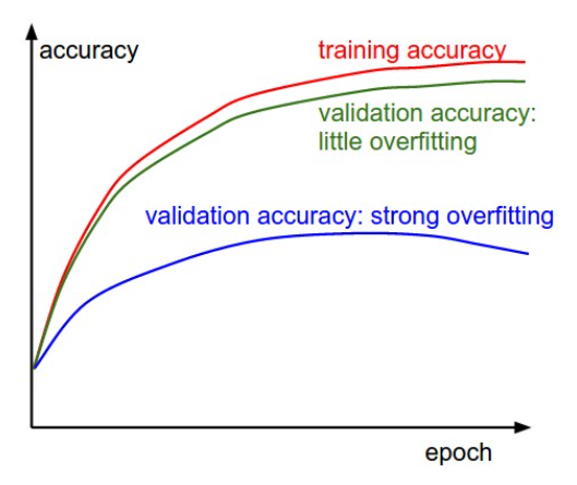
A few observations can be made here:
- As we train the model for more epochs, training accuracy improves.
- When we are not overfitting (green), validation accuracy tracks training accuracy.
- When we overfit (blue), validation and training accuracies have a large gap, and validation accuracy eventually even decreases.
Overtraining
A failure mode of some machine learning algorithms is overtraining.
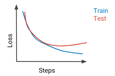
A closely related problem is undertraining: not training the model for long enough.
This can be diagnosed via a learning curve that shows that dev set performance is still on an improving trajectory.
Diagnosing Optimization Issues
Loss curves also enable diagnosing optimization problems.
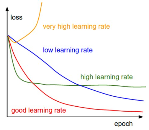
Each line is a loss curve with a different learning rate (LR).
- The blue training is still decreasing at the end: the LR is too low.
- The green line plateaus too soon and too high indicating a high LR.
- The yellow curve explodes: the LR was soo high that parameters took a step into a very bad direction.
The red loss curve is not too fast and not too slow.
Pros and Cons of Loss Curves
Advantages of using loss curves include the following.
- Producing loss curves doesn't require extra computation.
- Loss curves can detect optimization problems and overtraining.
Loss curves don't diagnose the utility of adding more data; when bias/variance diagnosis is ambiguous, use learning curves.

Part 3: Validation Curves
Validation curves help us understand the effects of different hyper-parameters.
Review: Model Development Workflow
The machine learning development workflow has three steps:
- Training: Try a new model and fit it on the training set.
- Model Selection: Estimate performance on the development set using metrics. Based on results, try a new model idea in step #1.
- Evaluation: Finally, estimate real-world performance on test set.
Validation Curves
ML models normally have hyper-parameters, e.g. L2 regularization strength, neural net layer size, number of K-Means clusters, etc.
Loss curves plot model peformance as a function of hyper-parameter values on training or development datasets.
Validation Curve: An Example
Consider the following example, in which we train a Ridge model on the digits dataset.
Recall the digits dataset introduced earlier in this lecture.
from matplotlib import pyplot as plt

plt.figure(figsize=(8,16))
_, axes = plt.subplots(2, 5)
images_and_labels = list(zip(digits.images, digits.target))
for ax, (image, label) in zip(axes.flatten(), images_and_labels[:10]):
    ax.set_axis_off()
    ax.imshow(image, cmap=plt.cm.gray_r, interpolation='nearest')
    ax.set_title('Digit %i' % label)
<Figure size 576x1152 with 0 Axes>
We can train an SVM with and RBF kernel for different values of bandwidth $\gamma$ using the validation_curve function.
from sklearn.model_selection import validation_curve

# https://scikit-learn.org/stable/auto_examples/model_selection/plot_validation_curve.html
param_range = np.logspace(-6, -1, 5)
train_scores, test_scores = validation_curve(
    SVC(), X, y, param_name="gamma", param_range=param_range,
    scoring="accuracy", n_jobs=1)
train_scores_mean = np.mean(train_scores, axis=1)
train_scores_std = np.std(train_scores, axis=1)
test_scores_mean = np.mean(test_scores, axis=1)
test_scores_std = np.std(test_scores, axis=1)
We visualize this as follows.
plt.title("Validation Curve with SVM")
plt.xlabel(r"$\gamma$")
plt.ylabel("Score")
plt.ylim(0.0, 1.1)
lw = 2
plt.semilogx(param_range, train_scores_mean, label="Training accuracy",
             color="darkorange", lw=lw)
plt.fill_between(param_range, train_scores_mean - train_scores_std,
                 train_scores_mean + train_scores_std, alpha=0.2,
                 color="darkorange", lw=lw)
plt.semilogx(param_range, test_scores_mean, label="Validation accuracy",
             color="navy", lw=lw)
plt.fill_between(param_range, test_scores_mean - test_scores_std,
                 test_scores_mean + test_scores_std, alpha=0.2,
                 color="navy", lw=lw)
plt.legend(loc="best")
<matplotlib.legend.Legend at 0x12cce2f98>

This shows that the SVM:
- Underfits for small values of $\gamma < 10^{-5}$
- Overfits for large values of $\gamma > 10^{-3}$ and the training and validation curves diverge.
Medium values of $\gamma$ are just right.
Part 4: Distribution Mismatch
So far, we assumed that the distributions across different datasets are relatively similar.
When that is not the case, we may run into errors.
Review: Datasets for Model Development
When developing machine learning models, it is customary to work with three datasets:
- Training set: Data on which we train the models.
- Development set (validation or hold-out set): Data used for tuning models.
- Test set: Data for evaluating the final performance of our model.
Review: Choosing Dev and Test Sets
The development and test sets should be from the data distribution we will see in production.
- This is because we want to be optimizing performance in deployment (e.g., classification accuracy on dog images).
- The training data could potentially be from a different distribution (e.g., include other types of animal images).
Distribution Mismatch
We talk about distribution mismatch when the previously stated conditions don't hold, i.e. we have the following:
- Our dev and test sets are no longer representative.
- Our training set is too different from the dev set.
The Training Dev Set
In order to diagnose mismatch problems between the training and dev sets, we may create a new dataset.
The training dev set is a random subset of the training set used as a second validation set.
Diagnosing Bias and Variance
We may use this new dataset to diagnose distribution mismatch. Suppose dev set error is high.
- If the training error is low, but training dev and standard dev errors are high, we are overfitting.
- If the training and training dev errors are low, but dev error are high, we have distribution mismatch.
As an example, suppose are building a cat image classifier.
- The training set consists of cats and other animals.
- The traning dev set also containts cats and other animals.
- The dev and test sets only contain cats.
Consider the following example:
- Our training set error is 2%.
- Our training dev set error is 6%.
- Our dev set error is 6%.
This is a typical example of high variance (overfitting).
Next, consider another example:
- Our training set error is 10%.
- Our training dev set error is 11%.
- Our dev set error is 12%.
- Human error is 1%.
This looks like an example of high avoidable bias (underfitting).
Finally, suppose you see the following:
- Our training set error is 4%.
- Our training dev set error is 5%.
- Our dev set error is 13%.
This is a model that is generalizing to the training dev set, but not the standard dev set. Distribution mismatch is a problem.
Quantifying Distribution Mismatch
We may quantify this issue more precisely using the following decomposition.
\begin{align*} \text{dev error} & = (\underbrace{\text{dev error} - \text{dev train error}}_\text{distribution mismatch}) \\ & + (\underbrace{\text{dev train error} - \text{train error}}_\text{variance}) + (\underbrace{\text{train error} - \text{opt error}}_\text{avoidable bias}) \\ & + \underbrace{\text{opt error}}_\text{unavoidable bias} \end{align*}Beyond the Training Set
We may also apply this analysis to the dev and test sets to determine if they're stale.
- First, collect additional real-world data.
- If the model generalizes well the current dev and test sets but not the real-world data, the current data is stale!
Addressing Data Mismatch
Correcting data mismatch requires:
- Understanding the properties of the data that cause the mismatch.
- Removing mismatching data and adding data that matches better.
The best way to understand data mismatch is using error analysis.